
Fashion
Why Leather Watch Boxes Never Go Out of Style
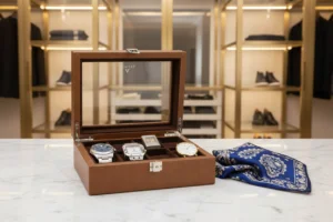
When you start collecting watches, it usually begins with just one. Maybe it was a gift for a graduation, a reward for a promotion, or simply a piece that caught your eye in a shop window. But as any enthusiast knows, one quickly becomes two, and two becomes a collection. Before you know it, you have a drawer full of timepieces that represent different memories and milestones.
As your collection grows, you realize that how you store your watches is just as important as the watches themselves. While there are many modern materials available today—like carbon fibre, plastic, or even high-tech metals—leather remains the gold standard. There is a reason why the world’s finest watches are so often paired with a classic leather watch storage box.
In this guide, we will look at why leather is still the best choice for your timepieces, how it protects your investment, and why it adds a touch of class to any room.
The Timeless Appeal of Leather
Leather has been used for centuries to protect valuable items. It is a material that feels personal. Unlike cold metal or hard plastic, leather has a warmth to it. It has a scent, a texture, and a way of changing over time that tells its own story.
A Natural Connection
There is a unique harmony between a mechanical watch and a leather case. A mechanical watch is a feat of traditional engineering—gears, springs, and levers working together without the need for electronics. Leather is a traditional material that has been crafted by hand for generations. Putting a mechanical masterpiece inside a leather box feels right. It respects the history of horology.
The Beauty of the Patina
One of the best things about high-quality leather is that it gets better with age. While most materials look their best the day you buy them and slowly degrade, leather develops a “patina.” This is a soft sheen that forms on the surface through use and exposure to the air. Your watch box will actually look more distinguished in ten years than it does today.
Protection That Goes Beyond the Surface
A watch box isn’t just about looking good on a dresser; it has a very practical job to do. It needs to keep your watches safe from the elements and accidental damage.
Shielding from Dust and Moisture
Dust is the silent enemy of a watch movement. Even if your watch is water-resistant, tiny dust particles can settle around the crown or the seals. Over time, these particles can work their way inside or cause the lubricants to dry out. A well-made leather box provides a tight seal that keeps out dust and helps regulate the humidity around your watches.
Preventing Scratches and Dents
If you leave your watches on a nightstand or in a jewellery tray, they are prone to “clashing.” This is when the metal of one watch rubs against another, leading to those annoying hairline scratches on the polished surfaces. A leather watch display case for men ensures that each watch has its own dedicated “home.” The soft interior lining acts as a cushion, making sure that even if the box is moved, the watches stay still and safe.
Why Leather Suits Every Interior
Whether your home is ultra-modern and minimalist or traditional and cozy, leather fits in perfectly. It is a neutral material that bridges the gap between different styles.
The Professional Look
For a professional, a leather watch box on a desk or a bookshelf sends a message of organization and attention to detail. It shows that you value your possessions and take care of the things you own.
The Home Decor Element
Leather comes in various colours—deep blacks, rich browns, tan, and even navy blue. This variety allows you to match the box to your furniture. A dark chocolate brown leather box looks stunning on an oak dresser, while a sleek black leather case looks sharp against a marble or glass surface.
Different Types of Leather for Different Tastes
Not all leather is the same. Depending on your personal style, you might prefer one finish over another.
- Full-Grain Leather: This is the highest quality. It uses the entire grain of the hide, meaning it is incredibly durable and will develop the best patina.
- Top-Grain Leather: A bit more processed to remove imperfections, this leather is very soft and has a consistent look.
- Saffiano Leather: Often used by luxury fashion houses, this leather has a cross-hatch pattern pressed into it. It is very resistant to scratches and water, making it a great choice for a box you might move around often.
- Vegan Leather: For those who prefer non-animal products, high-quality synthetic leathers now offer a very similar look and feel to the real thing while being very easy to clean.
Features to Look for in a Quality Watch Box
When you are ready to invest in a leather box, don’t just look at the outside. The internal features are what determine how much use you will get out of it.
The Quality of the Cushions
The cushions (the little pillows your watches wrap around) should be soft but firm. If they are too hard, they might put pressure on the bracelet. If they are too soft, the watch will flop around. Ideally, you want cushions that can compress slightly to fit different wrist sizes.
Clearance Under the Lid
There is nothing worse than closing the lid of a box and hearing the “clink” of the glass hitting the top. Always check that there is enough “headroom” for larger watches, especially if you own chunky divers or pilot watches.
Locking Mechanisms
While a watch box isn’t a safe, a simple lock and key can provide peace of mind. It keeps curious hands (like children) away from your delicate timepieces and ensures the lid stays shut if you ever need to transport the collection.
How to Care for Your Leather Watch Box
To ensure your leather box lasts as long as your watches, it needs a little bit of maintenance.
- Avoid Direct Sunlight: Just like your skin, leather can dry out and crack if left in the sun for too long. Keep your box away from windows.
- Dust Regularly: Use a soft, dry cloth to wipe away dust from the exterior.
- Condition the Leather: Once or twice a year, use a tiny amount of leather conditioner. This keeps the material supple and prevents it from becoming brittle.
- Clean the Interior: Use a lint roller or a soft brush to remove any dust from the velvet or microsuede lining inside the compartments.
The Versatility of Leather Storage
One of the reasons leather remains so popular is its versatility. It isn’t just for large boxes that sit on a desk.
Travel Rolls
If you are someone who travels for work or pleasure, you likely want to take more than one watch with you. A leather travel roll is the perfect companion. It is compact, fits easily into a carry-on bag, and provides the same level of protection as a full-sized box.
Single Watch Pouches
Sometimes you just need to protect one watch—perhaps while you are at the gym or during a quick change for dinner. A small leather pouch is a stylish and functional way to keep your watch from getting scratched in your pocket or gym bag.
Making the Right Choice for Your Collection
Choosing a watch box is a personal decision. It is the final “frame” for your collection. Think about how many watches you currently own and how many you plan to buy in the next two or three years. It is usually a good idea to buy a box with a few extra slots so your collection has room to grow.
A leather box is more than just a container; it is a statement of taste. It reflects the quality of the watches inside and ensures that every time you go to pick a watch for the day, the experience feels special.
Whether you are looking for a small case for your three most-worn pieces or a large cabinet for a lifetime of collecting, leather will always be the most sophisticated choice. It is a classic for a reason, and in the world of luxury watches, some things simply never go out of style.
Introduction
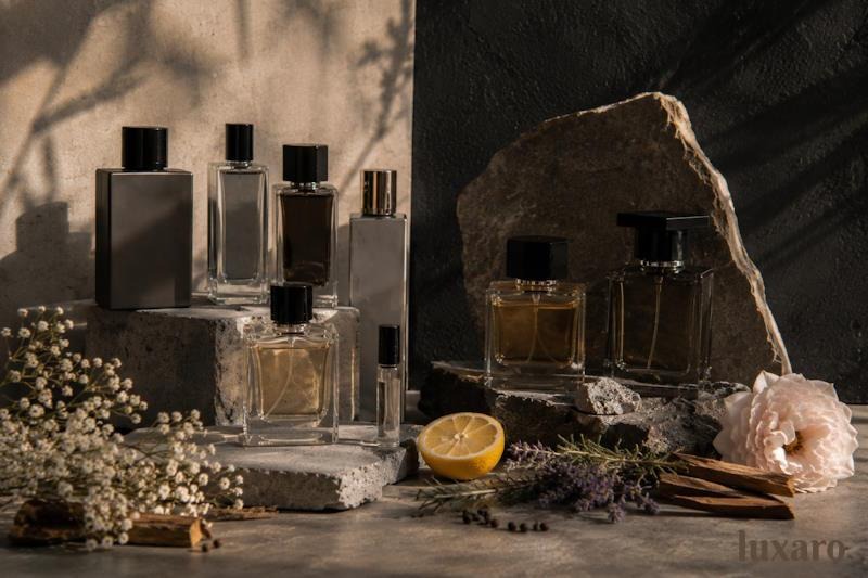
A few years ago, buying perfume often meant choosing from the same well-known designer brands found in department stores. Today, the picture looks very different. More people are discovering smaller fragrance companies through online searches, social media, and recommendations from friends. Instead of asking which designer perfume is the newest release, many shoppers are asking which fragrance smells the best, lasts well, and suits their personal style.
This shift has allowed small fragrance brands to compete in ways that were much harder in the past. They may not have huge advertising budgets or celebrity campaigns, but many have earned attention by focusing on carefully developed fragrances and being open about how their perfumes are made. For shoppers, this means there are now more choices than ever before and more reasons to look beyond the biggest designer names.
Shoppers Are Paying More Attention to the Fragrance
One of the biggest changes in recent years is how people judge perfume.
Instead of choosing a bottle simply because they recognise the logo, many buyers spend time reading about fragrance notes, scent families, and how a perfume develops throughout the day. They want to know whether a fragrance feels fresh, woody, floral, or warm before making a decision.
This has helped smaller fragrance brands compete because they often explain their perfumes in straightforward language. Rather than relying on famous names, they let the fragrance itself become the main focus.
As more people understand perfume, they become more interested in quality and craftsmanship than advertising alone.
Independent Brands Can Focus on Fewer Fragrances
Large perfume companies often release many new fragrances every year to appeal to different audiences.
Smaller brands usually work differently. Many build a carefully selected collection instead of producing dozens of releases. This gives them more time to develop individual fragrances and refine how each one smells.
For example, someone looking for a bold leather fragrance may compare several perfumes before choosing a Fucking Fabulous inspired perfume because they already know they enjoy that particular scent style. In this situation, the decision is often based on fragrance character rather than the size of the company behind it.
This approach has encouraged many shoppers to judge perfumes on their own experience instead of brand recognition.
Honest Information Builds Confidence
Buying perfume online becomes much easier when brands clearly explain what customers should expect.
Detailed descriptions, fragrance notes, and information about production methods help shoppers make informed decisions. Many independent fragrance brands also explain how their perfumes are created, giving buyers a better understanding of the craftsmanship involved.
Independent fragrance brands such as Luxaro have helped increase interest in French-made fragrances and small-batch perfume production by focusing on carefully developed scent profiles rather than relying only on designer branding.
This openness has helped build trust with people who want to understand more about the fragrances they wear.
More Choice Benefits Everyone
Healthy competition is good for perfume lovers.
As smaller brands continue to grow, shoppers benefit from having more fragrance styles, different approaches to perfume making, and a wider range of scent profiles to explore.
People who enjoy fresh citrus fragrances can easily compare several options. The same is true for lovers of woody, floral, gourmand, or amber perfumes.
Many shoppers also enjoy browsing a Luxaro fragrance collection because it allows them to explore different fragrance families in one place and better understand how each scent style differs from the next. Looking at a complete collection often makes it easier to recognise personal preferences instead of focusing on only one perfume.
Greater choice encourages people to discover fragrances that genuinely suit their own taste.
Practical Advice for Choosing Between Big and Small Brands
There is no rule that says a designer perfume is always the better choice or that an independent fragrance will automatically suit everyone.
The best approach is to compare fragrances on their own merits.
Read the scent description carefully and pay attention to the fragrance family. Think about perfumes you have enjoyed before and look for similar notes.
Customer reviews can also provide useful insights, especially when several people describe the same strengths and weaknesses.
It also helps to learn a little about the brand itself. Companies that explain how their perfumes are developed, where they are made, and what kind of fragrance experience they are aiming to create often give shoppers more confidence before buying.
Most importantly, choose a perfume because you enjoy the fragrance rather than because of the name printed on the bottle.
Conclusion
Small fragrance brands are changing the way many people think about perfume. By focusing on craftsmanship, clear fragrance descriptions, and carefully developed collections, they have shown that quality is not limited to the biggest designer names.
For shoppers, this means more choice and a better understanding of what makes a fragrance enjoyable to wear. Instead of relying only on familiar branding, more people are comparing scent profiles, fragrance families, and the overall wearing experience.
Taking a little time to learn about how perfumes are made and how different fragrance styles work makes it much easier to choose a scent that matches your own preferences. In the end, the most satisfying perfume is usually the one that feels right for you, regardless of the size of the brand behind it.
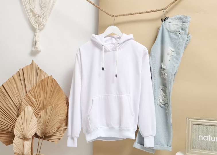
Finding the perfect hoodie size can make a huge difference in both comfort and style. Whether you are buying your first Essentials Hoodie Australia release or adding another piece to your collection, choosing the correct fit is one of the most important decisions you can make. Essentials Hoodies are known for their oversized design, which often creates confusion for first-time buyers who are unsure whether to size up, size down, or stick with their regular size. The good news is that understanding how Essentials Hoodie fit is relatively simple once you know what to look for. This guide explains everything Australian shoppers need to know about sizing, fit preferences, and how to select the right Essential Hoodie for their body type and personal style.
Understanding the Essentials Hoodie Fit
Before choosing a size, it is important to understand how an Essentials Hoodie is designed to fit. Unlike traditional hoodies that follow a regular cut, Essentials Hoodies feature a deliberately oversized silhouette. This oversized design includes wider shoulders, a roomier chest area, and longer sleeves. The relaxed shape is part of the signature streetwear aesthetic that has made the brand so popular around the world. Many first-time buyers assume they should size up to achieve the oversized look, but this is usually unnecessary because the hoodie is already designed with extra room.
Why Essentials Hoodie Sizing Feels Different
One of the most common questions customers ask is why Essentials sizing feels larger than standard hoodies. The answer lies in the brand’s design philosophy. The Fear of God Essentials Hoodie was created to embrace modern streetwear trends that focus on relaxed and comfortable fits. Rather than sitting close to the body, the hoodie is designed to drape naturally and create a loose silhouette. As a result, shoppers who are used to slim-fit clothing may initially find the sizing larger than expected. Understanding this difference can help prevent ordering the wrong size.
Should You Buy Your Normal Size?
For most people, the safest choice is to purchase their regular size. The oversized fit is already built into the design, allowing customers to enjoy the intended streetwear appearance without making additional sizing adjustments. If you normally wear a medium hoodie, choosing a medium Essentials Hoodie will usually provide the relaxed look the brand is known for. This recommendation applies to most Australian customers who want the authentic Essentials experience and prefer modern streetwear styling.
When to Size Down
Although regular sizing works for most people, there are situations where sizing down may be beneficial. If you prefer a more fitted appearance or dislike oversized clothing, choosing one size smaller can create a cleaner silhouette while still maintaining the signature Essentials aesthetic. Many customers who plan to wear their hoodies primarily with jeans or slim-fit trousers often prefer sizing down slightly to achieve a more balanced outfit. However, sizing down too much may reduce the relaxed look that makes Essentials Hoodies unique.
When to Size Up
Sizing up is generally not necessary because the hoodie is already oversized. However, some fashion enthusiasts intentionally choose a larger size to create an exaggerated streetwear look. This styling approach has become increasingly popular in 2026, especially among those who enjoy pairing oversized hoodies with baggy cargo pants or loose-fit denim. If maximum comfort and a highly relaxed appearance are your priorities, sizing up can work well. Just keep in mind that the hoodie may appear significantly larger than standard clothing.
Choosing the Right Size Based on Body Type
Body shape can also influence how an Essentials Hoodie fits. Individuals with broader shoulders often find that their regular size provides the ideal balance between comfort and structure. Those with slimmer builds may prefer sizing down if they want a slightly cleaner fit. Taller individuals usually appreciate the extra length provided by the standard oversized cut, while shorter wearers may choose a smaller size for a more proportional appearance. Ultimately, personal preference plays a major role in determining the best fit.
Essentials Hoodie Sizing for Australian Shoppers
The growing popularity of Essentials Hoodie Australia means more local shoppers are purchasing these pieces than ever before. Australian customers generally prefer comfortable and versatile clothing, making Essentials Hoodies a natural choice. When selecting a size in Australia, it is important to compare your measurements with the retailer’s sizing guide whenever possible. While the oversized fit remains consistent across collections, slight variations can occur between different releases. Taking a few moments to measure your chest and compare it with available size charts can help ensure a more accurate purchase.
Best Fit for Everyday Wear
If your goal is everyday comfort, your normal size is usually the best option. This allows you to enjoy the relaxed fit without the hoodie appearing excessively large. A properly fitted Essentials Hoodie should feel comfortable around the shoulders, provide sufficient room through the chest, and fall naturally around the waist. This balance creates a versatile piece that can be worn for casual outings, travel, study sessions, and weekend activities.
Styling Different Hoodie Sizes
The size you choose can also influence your overall outfit. A standard oversized fit pairs perfectly with cargo pants, joggers, and modern sneakers. This combination creates the classic streetwear appearance associated with the Essentials brand. A slightly smaller fit often works well with slim-fit jeans and minimalist footwear for a cleaner, more refined look. Meanwhile, extra-large oversized fits are commonly styled with baggy trousers and statement sneakers to create bold streetwear outfits that reflect current fashion trends.
Why the Fear of God Essentials Hoodie Remains Popular
The continued success of the Fear of God Essentials Hoodie comes from its ability to deliver comfort, quality, and style in one package. Its oversized silhouette appeals to modern fashion preferences while maintaining versatility for everyday wear. Unlike many trend-driven garments, Essentials Hoodies and Essentials Shorts remain relevant because their design focuses on timeless simplicity rather than short-lived fashion movements. Choosing the right size allows wearers to fully appreciate these qualities and enjoy the hoodie exactly as intended.
Common Sizing Mistakes to Avoid
Many first-time buyers make the mistake of automatically sizing up because they hear Essentials Hoodies run large. In reality, the oversized design is intentional and should not be confused with incorrect sizing. Another common mistake is choosing a size based solely on appearance rather than personal comfort preferences. Taking time to understand the intended fit and considering how you plan to wear the hoodie can help avoid disappointment after purchase.
Final Thoughts
Choosing the right Essentials Hoodie size in Australia is easier once you understand the brand’s signature oversized fit. For most shoppers, selecting their normal size provides the perfect balance of comfort and modern streetwear style. Whether you are buying your first Essential Hoodie, adding another piece to your collection, or investing in a Fear of God Essentials Hoodie, understanding the sizing philosophy can help you make a more confident purchase. By considering your body type, style preferences, and intended use, you can find the perfect fit and enjoy everything that makes Essentials Hoodies one of the most popular streetwear staples in 2026.

Finding premium activewear at a discounted price is always exciting, especially when it comes to Vuori. Known for its exceptional comfort, performance fabrics, and modern designs, Vuori has become one of the fastest-growing athleisure brands in the United States. Whether you’re looking for comfortable joggers, versatile hoodies, performance shorts, or everyday activewear, shopping Vuori Clothing on sale in the USA is one of the smartest ways to upgrade your wardrobe while saving money. As more Americans embrace active lifestyles and comfortable fashion, Vuori continues to stand out for its ability to blend athletic performance with everyday wear. The good news is that shoppers can often find excellent deals on selected collections throughout the year, making premium activewear more accessible than ever. Vuori’s official sale sections regularly feature discounted men’s and women’s apparel, including hoodies, joggers, leggings, shorts, and performance tops.
Why Vuori Clothing Is So Popular in the USA
Vuori has quickly gained a loyal customer base across the United States thanks to its focus on quality, comfort, and versatility. Founded in California, the brand was inspired by active coastal lifestyles and has successfully created apparel that performs equally well during workouts and everyday activities. The company has expanded rapidly and is now one of the leading names in modern athleisure fashion. Unlike traditional sportswear brands that focus purely on athletic performance, Vuori designs clothing that transitions seamlessly from the gym to casual settings. This versatility makes Vuori products a favorite among professionals, travelers, fitness enthusiasts, and anyone seeking comfortable everyday clothing.
What You Can Find in a Vuori Sale
One of the biggest advantages of shopping Vuori sales is the wide variety of products available at reduced prices. Shoppers can often find discounts on some of the brand’s most popular categories. Men’s collections frequently include performance shorts, joggers, hoodies, sweatpants, training tops, and lightweight outerwear. Women’s sale collections often feature leggings, sports bras, tanks, hoodies, jackets, and lounge essentials. Vuori’s sale sections regularly include both seasonal releases and customer favorites. The brand’s reputation for premium fabrics means that even discounted items maintain the same high-quality construction and comfort that customers expect from full-price products.
Why Buying Vuori on Sale Makes Sense
Vuori Clothing is known for its premium pricing, which reflects the quality of materials and craftsmanship used in each piece. While many customers consider the products worth the investment, sales events provide an opportunity to enjoy the same quality at a more affordable price. Discounted collections often include substantial savings on activewear staples that can remain wardrobe essentials for years. Various retailers and seasonal promotions have featured discounts ranging from 20% to 50% or more on selected items. For shoppers building a complete athleisure wardrobe, sales can make it easier to purchase multiple items while staying within budget.
Best Vuori Products to Buy During a Sale
When shopping a Vuori sale, some categories consistently provide outstanding value. Joggers remain one of Vuori’s most recognized products due to their exceptional softness and versatility. Many customers wear them for workouts, travel, lounging, and casual outings. Hoodies and sweatshirts are also popular choices because they combine premium comfort with timeless styling. These pieces are easy to layer and suitable for year-round wear. Performance shorts are another favorite among active individuals. Designed for movement and comfort, they work well for training sessions, running, and everyday activities. Leggings and women’s activewear collections also attract significant attention during sale periods because of their combination of flexibility, durability, and flattering fits. Various sale events have highlighted discounts on these popular categories.
How to Find the Best Vuori Deals
Finding the best Vuori discounts often requires a bit of strategy. Since the brand does not frequently offer large sitewide promotions, many shoppers regularly monitor sale sections for newly added markdowns. The official Vuori sale pages are often the best place to start when searching for discounted inventory. Seasonal clearances, end-of-season promotions, and limited-time offers can provide significant savings on select products. Some shoppers also look to authorized retailers that occasionally offer discounted Vuori products during special events. Community discussions frequently mention finding discounted Vuori apparel through selected retail partners and seasonal promotions.
Vuori Clothing for Everyday Lifestyle
One reason Vuori continues to grow in popularity is its ability to fit seamlessly into modern lifestyles. Today’s consumers want clothing that can handle multiple situations throughout the day without sacrificing comfort or style. Vuori products are designed for movement, but they are equally suitable for working from home, traveling, running errands, and casual social events. This versatility allows customers to get more value from every purchase. Instead of maintaining separate wardrobes for exercise and leisure, many people now prefer apparel that can serve both purposes. Vuori has successfully positioned itself as a solution to this demand.
Seasonal Shopping Opportunities
Different times of the year often present unique opportunities to save on Vuori apparel. End-of-season sales are particularly popular because retailers make room for new collections by discounting previous inventory. Spring and summer transitions frequently bring markdowns on outerwear and cooler-weather essentials, while fall and winter promotions may feature discounts on shorts, tanks, and lighter activewear pieces. Because certain sizes and colors can sell out quickly during sales, many experienced shoppers monitor inventory regularly and act quickly when desired products become available. Community discussions often note that popular sale items may not remain in stock for long.
Why Vuori Continues to Lead the Athleisure Market
The success of Vuori goes beyond trends. The brand has established a strong reputation by consistently delivering premium products that prioritize both function and comfort. Its focus on soft fabrics, clean designs, and versatile styling has helped attract customers looking for alternatives to traditional athletic brands. The company’s rapid growth and expanding retail presence reflect the increasing demand for premium athleisure wear across the United States. As more consumers invest in quality clothing that supports active lifestyles, Vuori remains one of the most trusted names in the category.
Final Thoughts
Shopping Vuori Clothing on Sale in USA is one of the best ways to experience premium athleisure apparel without paying full price. Whether you’re searching for joggers, hoodies, leggings, shorts, or performance essentials, sale events provide an excellent opportunity to upgrade your wardrobe while maximizing value. With high-quality materials, exceptional comfort, and versatile styling, Vuori continues to be a top choice for active individuals throughout the United States. By keeping an eye on seasonal promotions and sale collections, shoppers can enjoy significant savings on some of the brand’s most popular products while building a wardrobe designed for both performance and everyday life.
FAQs
Does Vuori have a sale section?
Yes, Vuori offers dedicated sale sections featuring discounted men’s and women’s activewear, loungewear, hoodies, joggers, shorts, and accessories.
How much can you save during a Vuori sale?
Discounts vary, but promotions and sale events have featured savings ranging from 20% to 50% or more on selected items.
What are the most popular Vuori sale items?
Joggers, hoodies, leggings, shorts, performance tops, and lounge apparel are among the most sought-after discounted products.
Is Vuori worth buying on sale?
Yes. Vuori products are known for premium quality, comfort, and durability, making sale purchases an excellent value for many shoppers.
Where can I find Vuori clothing deals in the USA?
You can monitor Vuori’s official sale collections and selected authorized retailers that occasionally offer discounted inventory.

How Small Fragrance Brands Are Challenging the Biggest Designer Names

Your Lawn Can Be Lush—Without Harming the Planet

How Interior Painting Improves Your Home’s Appearance and Value

Healthy Lifestyle Exercise Guide for Women: How Move More Age Better Build Strength and Feel Extraordinary 2026

Garment Quality Control Checklist: The Important Role of Sewing Threads

4 Cost Factors That Affect Air Conditioner Installation Cost in Singapore for Split AC Units

Improving Sanctions Controls During Customer Remediation Projects

How Financial Pressure Influences Local Business Growth

Vuori Clothing on Sale in the USA

How to Choose the Right Essentials Hoodie Size in Australia
4 Cost Factors That Affect Air Conditioner Installation Cost in Singapore for Split AC Units
Improving Sanctions Controls During Customer Remediation Projects
How Financial Pressure Influences Local Business Growth
Vuori Clothing on Sale in the USA
How to Choose the Right Essentials Hoodie Size in Australia
How Small Fragrance Brands Are Challenging the Biggest Designer Names
Introduction A few years ago, buying perfume often meant choosing from the same well-known designer brands found in department stores....

Your Lawn Can Be Lush—Without Harming the Planet
Most homeowners want a thick, green yard. What they don’t always want is the trail of chemical runoff, wasted water,...

How Interior Painting Improves Your Home’s Appearance and Value
Introduction. Why Interior Painting Is More Than a Cosmetic Upgrade Your home’s interior says a lot about how well it...

Healthy Lifestyle Exercise Guide for Women: How Move More Age Better Build Strength and Feel Extraordinary 2026
Why Exercise Is Non-Negotiable for Women’s Long-Term Health and Radiance Exercise is not simply a tool for weight management ,...
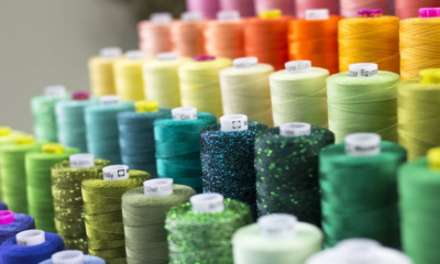
Garment Quality Control Checklist: The Important Role of Sewing Threads
Top few things that come to mind when we talk about the quality of garments are the fabric, the design,...


How Apparel Manufacturers Can Improve Productivity Through Thread Optimization
Apparel manufacturers can really improve how well they make clothes by paying attention to the thread they use. When people...


Precision Stump Grinding: Analyzing Mechanical Stresses and Tool Geometries on Vermeer Cutters
Introduction Stump grinding is an abrasive, high-impact operation that quickly exposes the limitations of low-grade cutting tools. When a grinding...


What to Expect From a Full Tattoo Removal Timeline
Getting a tattoo removed takes months, not weeks, and the process rarely moves in a straight line. A single tattoo...


Why Mice Are a Common Problem in London Homes
London homeowners often underestimate how quickly a small mouse problem can turn into a serious infestation. These tiny rodents are...

4 Cost Factors That Affect Air Conditioner Installation Cost in Singapore for Split AC Units
Key Highlights Introduction When the time comes to upgrade your home’s cooling, the first question on most people’s minds is...
-

 Tech2 months ago
What is Spaietacle? Inside the New Era of Interactive Digital Platforms
-

 Food3 months ago
Crocolini Explained What Is Crocolini Vegetable Toy and More
-
 Entertainment3 months ago
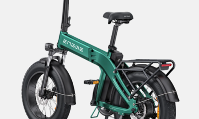
¿Es ENGWE una Buena Marca de Bicicletas Eléctricas? Análisis Real en España
-

 Celebrity9 months ago
Shaun Holguin: Jodie Sweetin’s First Husband and a Life Outside the Spotlight
-

 Celebrity8 months ago
Meet Billie Early — Everything About Cameron Diaz’s Mother,
-

 News9 months ago
Who is Taimi Li? Everything About Jet Li’s Daughter
-

 Celebrity8 months ago
Who is Michael Ciminella? Everything You Need to Know About Ashley Judd’s Father
-

 Celebrity9 months ago
Maureen E. McPhilmy – Biography of Bill O’Reilly’s Ex-Wife Life After Divorce